Mini photoshoot


Magazine advert on our genre
 Here the artist is also an artist that fits into our genre. We can tell this by seeing the pose of the artist which is very layed back, the artist name stands out and the background is very plain and simple. All these identify help the audience to identify the genre. We will be using the idea of having the plain background with no patterns. We will also be having the artist taking u most the advert and the artist name in bold.
From this advert we will take the idea of having the artist taking up most the advert. Also the idea of having the artist name stand out at the top of the advert. Again the artist name is bold and the artist is taking up most the advert. We will also be doing this because it is a way of promoting the artist to the audience. We will copy the pre order part of the advert because alot of artists from our genre have this on their adverts.
 This is our final magazine cover. We took all the comments from our peers and improved the magazine advert and this is our final product. We used diffrent fonts for the diffrent text so that it is more appealing to the eye and catches the readers attenton. We also changed the colours that we used previously for the text and changed it to green and pink so that it matched with our CD cover.


Blue: was our third draft of the magazine cover. Everyone who saw it liked it but said that the cutting out of the artist was very bad so when we do the final cover we will have everything the same but not cut out the artist and leave the picture as a whole for the background rather then have it blue. Also we were told to use diffrent fonts rather than the same one throughout to catch the readers attention.


Picture :This was our first magazine cover. It did not look very good an was very plain. Peer groups had a look at it and said it ddint look much like a agazine advert but just a picture with bits of writing ontop.
We are still not happy with our advert so we will modify it again to create a official looking final oneTuesday, 7 December 2010
Cd digipack prepartion
On the front cover of our cd cover we will have a large picture of our artist which is a convention of R'n'B CD covers, his name will be in the biggest font then the title of the song will be in a similar but smaller font.
On the inside of the CD we will have two more pictures of our actor one will be a long shot and the image will include song lyrics. the other image will be a close up which includes a message from the artist in his own hand writing.
The back of our CD cover will have a a long midshot of him sitting on the floor and looking into the camera, the notion of looking is part of Goodwins theory. the back of the CD will include track listings, ratings from music magazines and the record labels logo. Finally a quote from the artist.
We will Entice people to buy the CD and not just download it by including a limited addition double sided poster.
Our magazine advert will use the same colour scheme and font and maybe the same our similar image using thee same pose
On the front cover of our cd cover we will have a large picture of our artist which is a convention of r'n'b cd covers, his name will be in the biggest font. Then the title of the song will be in a similar but smaller font
Photos i have taken of our artist for our digipak

The back of our cd cover will have a a long midshot of him sitting on the floor and looking into the camera, the notion of looking is part of goodwins theory. The back of the cd will include track listings, ratings from music magazines and the record labels logo. Finally a quote from the artist.
We will Entice people to buy the cd and not just download it by including a limited addition double sided poster.
Our magazine ad will use the same colour scheme and font and maybe the same our similar image using three same pose

this image is suitable for both the front and the back of the disc. i think it sells the artist well as it focused on the way he looks and his image. his ear piercing and eyebrow slit are visable yet he doesnt appear to be rough due to his pose. he looks sensitive which will appear female fans

this is one of our favorite pictures, we asked him to clutch his heart as our song is about love. His high end ralph lauren top is a very popular with r'n'b stars. his buttons are done up all the way to the top so he looks sophisticated which conforms to the conventions of r'n'b. we are thinking of using this image as our single cover.

the notion of looking is used in the image which is very common in r'n'b cd covers. he is almost flirting with the camera which can be seen as voyeurism
RnB cd cover research


here is a example of R'n'B a digipack


Usher sitting in between the woman's legs to add voyeurism. His name in large white font catches the eye as everything else is rather dark

layed back body language
His name in bright red font so you know who he is. shirt unbuttoned to add a little voyeurism which is a common feature of r'n'b videos

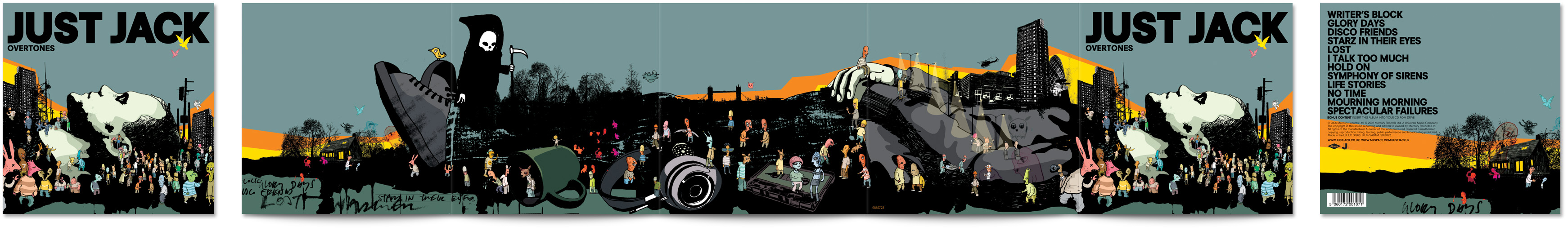
This a cd cover from our genre Rnb. From this we can see the notion of looking and it is making the artist look like a god because all the hands are trying to touch him . In this just like Chris browns cd cover the artist takes up most the room so we will be doing this in our cd cover to promote the artist.From this cd cover we can see that the name of the artist stands out so we will also have the name of the artists in bold and big at the top of the cd cover. The song name will be at the bottom just like Lloyd's cover.
Nazmin...xxx

The reason why we chose to use a cold colour for example the blue is to represent the water in the ice melting this relates to the lyrics of the song. the name of the artics is in a big font this s because we want all our audience to know who the singer of the song is this is a way of promoting claude kelly.
we also write the name of the song on the top so that it can be easier to find the song.
ruchi, olivia and mariam
Final draft of cd cover - back cover

front cover


this is our final magazine cover we created after looking at our audience feedback we have used the colours pink and green which feature in our digipak so the audience can link the two together. we have included facebook, youtube and twitter logos to show our artist is able to interact with his fans and tour dates are easily available.
we used a picture of khalid in a car because in r'n'b artist usually show off in their fancy cars in videos as it is part of the lavish lifestyle they chase.
olivia
we used a picture of khalid in a car because in r'n'b artist usually show off in their fancy cars in videos as it is part of the lavish lifestyle they chase.
olivia